


Over the last seven years, a lot has changed: the media industry, political landscape, our audience and their life stages, and design needs for our growing company. I oversaw theSkimm’s rebrand that launched in May of 2020, leading the company’s executives and co-founders through the comprehensive process over the course of 8 months. I began the process by developing an RFP to outline the project and our needs, as well as a list of prospective agencies and design studios for the project.
We received a number of proposals, and I had created a rating rubric for our leadership team to rank the pitches that resonated most with them. From there we selected 4 finalists, whom we met in person and reviewed the proposals live. We selected one firm, Pentagram, to partner with us for the project.
The project was divided into 5 phases where we spent the first 3 months focused on assessing the current brand, our brand positioning, architecture & nomenclatures.
Once we aligned on these elements we were able to begin the visual portion of the project.
Pentagram began this stage by presenting us with four directions for the brand identity. With many workshops, feedback discussions and pressure testing done internally, we selected a direction to further develop.
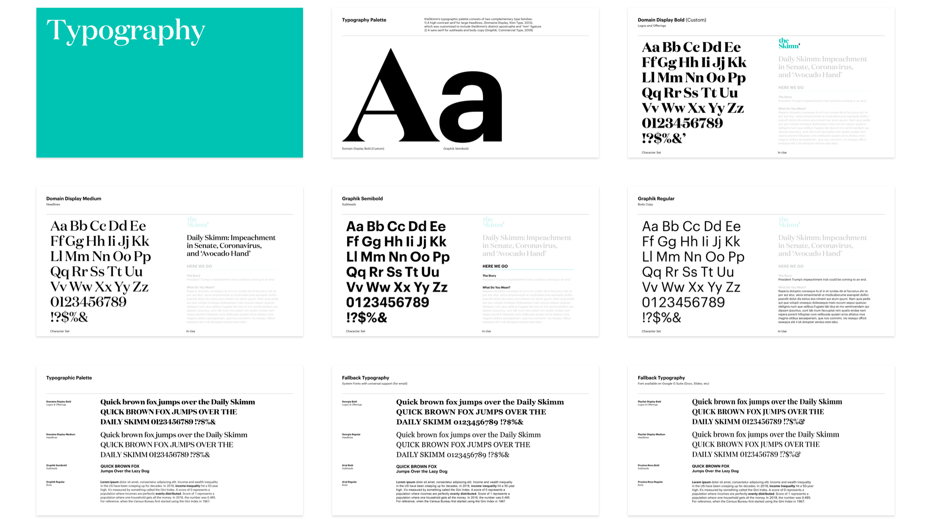
theSkimm’s custom apostrophe is both a brand mark and a syntactical device. A nod to it’s original role with the brand – used as playful abbreviation in words like Skimm’rs, Skimm’bassadors and Skimm’ologist – in it’s new role it also functions as a linking device, connecting theSkimm to its various sub brands – World, Money, MBA, Well and Picks. Traditionally used for contractions and abbreviations, the apostrophe symbolizes conciseness and efficiency. Embracing a punctuation mark as a brand mark denotes theSkimm’s strong connection to the written word and original mission of making complex ideas clear and accessible.
Once we solidified the core elements of the brand, I worked in partnership with the Pentagram team to develop the rules and guidelines of the brand identity.
As the design guidelines were handed off to our internal team I developed a plan of how we would design and build all brand assets and launch our brand publicly. I broke the process up into 5 design sprints. Each of our designers has specific goals and objectives of each sprint whether that was further explorations of our illustration style & library, creating video and social media templates or brand materials for our sales team.
6 weeks, 9 designers, all with the same goal of hitting our rebrand publish launch. Video compilation of the incredible work done by our team where you can clearly see how we begin implementing and fine tuning the new brand.
We began the sprints with an exercise to clearly define our design principles which we were able to then reference in all future sprint critique and feedback sessions.
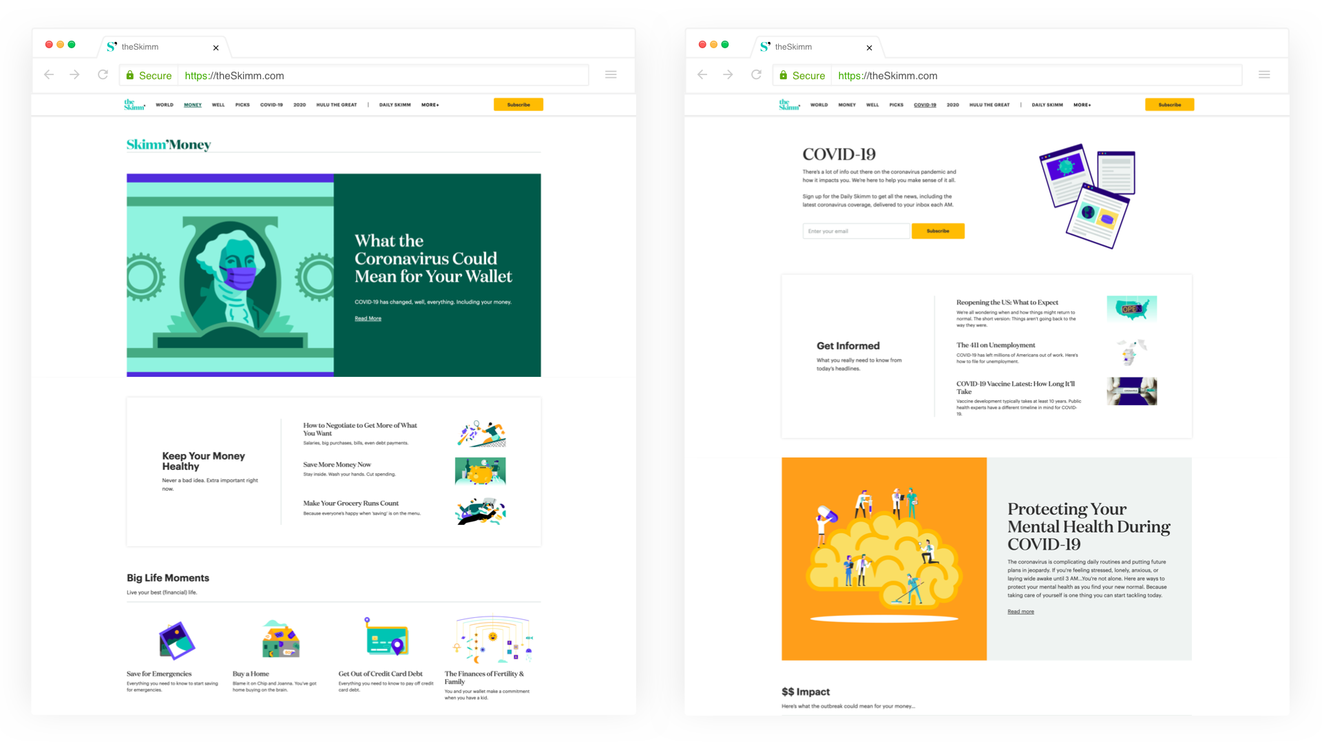
We redesigned all of our core products including our newsletter, app, website, podcasts and tentpole campaigns. Our team worked cross functionally with our tech, product and editorial teams during this phase to properly unveil and educate everyone on the new brand identity.
The Daily Skimm
theSkimm.com
Social Media
Video Series
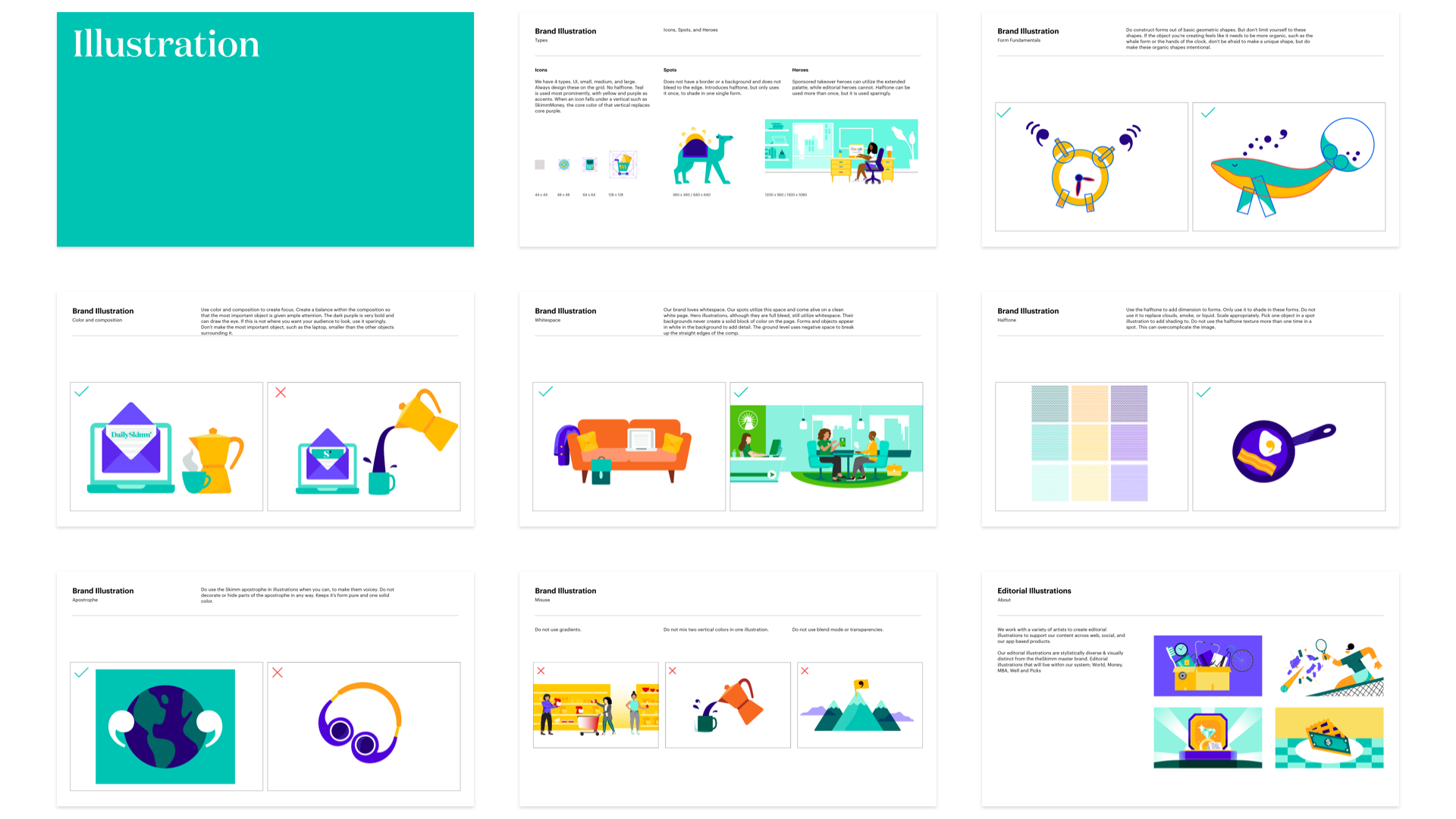
We couldn’t fully align with Pentagram on illustration and character style, as their approach didn’t meet our brand’s extensive needs. We ultimately handled this part of the project internally.
The most challenging (and exciting) portion of this project was the evolution of our previous and singular brand character, to a squad of characters that would be used to represent the diversity and inclusivity of our users. These characters are uniquely utilized for both internal brand visuals as well as the partnership advertising campaigns we develop as a primary source of our company’s revenue.
This project would not have been possible without so many talented people, designers, our cross functional teams at theSkimm and Pentagram.
Credit:
Pentagram Team: Natasha Jen, Yotam Hadar, Jonathan Katav, Taylor Holland
Creative Direction: Michael Gray
Designers: Minhee Kim, Jacqui McCullough, Lindsay Lange, ML Howell, Darren Chan, Ronlee Ben-Gal, Daniel Creel, Michelle Nahmad